
Table of content
- What Is a Conversion Path?: It’s the series of steps a customer takes before completing an action, like making a purchase. Most customers interact with multiple touchpoints before converting.
- Why It Matters: Visualizing these paths makes it easier to spot patterns, bottlenecks, and opportunities. Companies using this approach report 30-50% higher conversion rates.
- Key Tools and Techniques:
- Funnel charts for linear paths and identifying drop-offs.
- Flow and path charts (e.g., Sankey diagrams) for complex, multi-channel journeys.
- Platforms like Pathmetrics to track cross-channel and cross-device interactions.
- Metrics to Focus On: Conversion rates, drop-off points, channel contributions, and path length.
- Next Steps:
- Collect clean, consistent data.
- Use attribution models (e.g., first-touch, last-touch, or multi-touch) to assign credit to touchpoints.
- Choose the right visualization tools for your needs.
- Turn insights into action by optimizing weak areas and testing improvements.
Quick Comparison of Visualization Methods:
| Chart Type | Best For | Limitations |
|---|---|---|
| Funnel Charts | Linear processes, drop-offs | Not ideal for non-linear journeys |
| Sankey Diagrams | Multi-channel, complex flows | Can get cluttered with many paths |
| Sunburst Charts | Hierarchical, large datasets | Limited for cross-behavior patterns |
Start by defining clear goals, tracking user behavior across channels, and visualizing data to make smarter decisions that boost your ROI.
How to Add Conversion Path to Looker Studio – KevinHowTo

Core Elements of Conversion Path Visualization
Creating effective conversion path visualizations starts with getting the basics right. These foundational elements are what turn raw data into meaningful insights, rather than just attractive graphics.
Data Collection and Setup
The backbone of any visualization is high-quality first-party data. This includes information about customer interactions on your website, apps, and other owned platforms. First-party data is especially crucial as privacy rules tighten, making third-party cookies less reliable.
UTM parameters are key to understanding where your traffic originates. These small snippets of code added to URLs help you track the campaign, source, and medium for each visitor. For instance, a URL like:
yoursite.com?utm_source=facebook&utm_medium=social&utm_campaign=spring2025
shows that the traffic came from your Facebook campaign for Spring 2025.
Focus on capturing critical data points such as touchpoints, channels, landing pages, lead magnets, and calls-to-action. As consumer behavior spans multiple devices, your tracking system should connect interactions across mobile and desktop. For example, a customer might browse your site on their phone but complete their purchase on a laptop. Linking these activities provides a unified picture of their journey.
Once your data is in place, the next step is selecting an attribution model to assign credit to each touchpoint effectively.
Attribution Models Explained
Attribution models play a crucial role in determining how you credit different touchpoints for conversions. The model you choose can significantly influence how you perceive channel performance and allocate your marketing budget.
- First-touch attribution assigns all credit to the first interaction. This is perfect for measuring which channels are best at creating awareness but ignores the nurturing process.
- Last-touch attribution gives full credit to the final interaction before conversion. It highlights the channels that close deals but overlooks earlier influences.
For a more balanced view, multi-touch attribution distributes credit across multiple touchpoints. Here are some common approaches:
- Linear attribution spreads credit equally across all interactions, offering a balanced perspective but potentially overlooking the true impact of key touchpoints.
- Time-decay models assign more weight to recent interactions, making them ideal for short sales cycles but undervaluing early touchpoints.
- Position-based attribution typically gives 40% credit to the first and last touchpoints, with the remaining 20% distributed among middle interactions.
| Attribution Model | Credit Distribution | Best For | Limitations |
|---|---|---|---|
| First-Touch | 100% to first interaction | Awareness campaigns | Ignores nurturing efforts |
| Last-Touch | 100% to final interaction | Identifying closing channels | Overlooks early influences |
| Linear | Equal across all touchpoints | Balanced channel view | May not reflect true influence |
| Time-Decay | More credit to recent actions | Short consideration sales cycles | Undervalues initial touchpoints |
Advanced tools like Pathmetrics offer multi-touch attribution that consolidates data from ads, SEO, social media, and email campaigns. This approach reveals how each channel contributes to conversions and revenue, enabling smarter budget decisions based on actual performance rather than guesswork.
Despite the benefits of multi-touch attribution, 58% of marketers still rely on single-touch models, even though nine out of ten value attribution highly.
Once you’ve assigned credit using the right model, the next step is to focus on metrics that provide actionable insights.
Metrics to Track
Metrics should align with your business goals. Prioritize tracking conversion rates, channel contributions, drop-off points, and cross-device behavior. These insights can help pinpoint bottlenecks in the customer journey.
Path length and time to conversion are particularly useful for understanding your sales cycle. Shorter paths often lead to higher conversion rates, emphasizing the importance of streamlining the customer journey.
For more granular insights, monitor form conversion rates, email engagement, and content interaction. Micro-conversions – like email signups, content downloads, or demo requests – can serve as early indicators of future macro-conversions, such as purchases.
Interestingly, the top 10% of websites achieve conversion rates of 11% or higher. However, your targets should reflect your industry, business model, and the complexity of your customer journey.
On average, customers interact with four different channels before making a purchase. Your metrics should account for this multi-channel reality, helping you optimize the entire journey rather than focusing on individual touchpoints.
Next, we’ll explore visualization techniques that turn these metrics into actionable insights.
Visualization Methods and Tools
Turning raw conversion data into meaningful insights requires effective visualization techniques. Choosing the right method can help you uncover opportunities and address challenges in your conversion process.
Funnel Charts
Funnel charts are a go-to tool for visualizing linear conversion paths. They illustrate how users move through each step of a process, making it easier to pinpoint where drop-offs occur.
For instance, let’s say an email campaign sends 5,676 messages. Out of those, 3,872 recipients view the email, 1,668 click through, 610 add items to their cart, and 565 complete their purchase. A funnel chart would highlight significant drop-offs, such as the gap between viewing and clicking. This could signal a need for clearer calls-to-action or more engaging content.
Funnel charts work best for processes with at least three stages, such as sales funnels, onboarding workflows, or checkout sequences. However, they’re less effective for complex, non-linear journeys where users may skip steps or enter at different points.
To improve clarity, use distinct colors for each stage and include annotations to explain sharp declines. For example, if many users abandon their carts before purchasing, you might discover that unexpected shipping costs are the culprit.
With over 570,000 websites using sales funnel technology to track user behavior, funnel charts remain one of the most widely used tools for conversion analysis.
For more intricate, non-linear journeys, flow and path charts provide better solutions.
Flow and Path Charts
When customer journeys become more complex, funnel charts may not suffice. Flow and path charts, such as Sankey diagrams and sunburst charts, excel in these scenarios. They allow you to visualize how users interact across multiple channels or website sections before converting.
Sankey diagrams are particularly useful for mapping user actions before or after a specific event. They can handle multiple entry and exit points, making them ideal for analyzing how users navigate through different touchpoints.
Sunburst diagrams, on the other hand, display hierarchical data in a circular format. They’re great for summarizing large datasets in a compact way. As Jacob Joseph, Head of Data Science, puts it: "Sunburst diagrams best depict user journeys".
Here’s a quick comparison of these visualization types:
| Visualization Type | Best For | Limitations |
|---|---|---|
| Funnel Charts | Linear processes, identifying drop-offs | Struggle with non-linear paths |
| Sankey Diagrams | Multi-channel journeys, complex flows | Can become cluttered with many paths |
| Sunburst Charts | Large datasets, hierarchical paths | Limited for showing cross-behavior patterns |
Sunburst charts are particularly effective for visualizing long, complex journeys with multiple touchpoints, especially when analyzing sequences beyond three steps.
These tools provide a solid foundation for advanced visualization features offered by platforms like Pathmetrics.
Pathmetrics Visualization Features
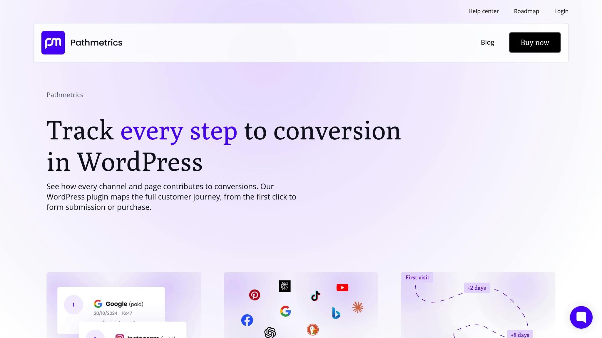
Platforms like Pathmetrics take visualization to the next level by offering tools tailored to every stage of the user journey. The platform provides three main chart types: Before an Event, Between Events, and After an Event.
- The Before Event view shows actions leading up to a conversion. Entry Nodes reveal the channels and touchpoints driving users toward specific goals.
- The Between Events view tracks movement between actions, helping you understand how users transition from initial interest to final purchase. For example, you can analyze steps like product views, wishlist additions, and checkout completions.
- The After Event view highlights user behavior post-conversion, including Drop-Off Nodes that indicate where users disengage. This insight is invaluable for improving retention and identifying upsell opportunities.
Pathmetrics answers critical questions like: What do users do before converting? Where do they drop off? How do they navigate between steps?. Its filtering options allow you to refine data by criteria such as URLs, browsers, user segments, and engagement types.
"Conversion funnel visualization makes it easier to extract the key insights from user behavior data. Thanks to that, teams need less time and energy to make data-driven decisions to optimize the customer journey and improve the user experience." – Saffa Faisal, Senior Content Editor
What sets Pathmetrics apart is its ability to track user actions across multiple platforms, from websites to apps. This ensures a comprehensive view of the customer journey, from the first ad impression to the final conversion.
Interactive features like "+" and "–" icons let you add or remove steps in path charts. This flexibility allows you to zoom in on specific segments or step back for a broader perspective, making it easier to identify bottlenecks and hidden opportunities in your conversion process.
sbb-itb-1aa22f1
Best Practices for Better Visualizations
Creating effective conversion path visualizations requires clean data, the right chart type, and a focus on actionable outcomes.
Keep Data Clean and Consistent
Messy or inconsistent data can derail even the best strategies. In fact, poor data quality costs businesses an average of $12.9 million annually. To avoid this, start by automating your data integration processes. Automated tools can help standardize data across channels, reducing the risk of manual entry errors.
For external campaigns, use consistent UTM parameters with a standardized naming system. For example, stick to "email_newsletter" instead of switching between terms like "email", "newsletter", or "email-campaign." This approach ensures accurate grouping in your flow charts.
Make it a habit to review your data weekly. Look for and address duplicates, outdated entries, or formatting inconsistencies. For instance, if a user appears twice in your conversion path due to being tracked on different devices, resolve the duplication right away.
Whenever possible, centralize your data into a single platform. Fragmented data spread across multiple systems can create blind spots in your visualizations, making it harder to identify key touchpoints.
"Accurate data is the backbone of strategic decision-making, influencing everything from measurement and campaign optimization to budget allocation." – Tom Rennell, Senior Content and Communications Manager, Adverity
Lastly, assign clear ownership of data for each channel. This accountability ensures better organization and more reliable insights.
Choose the Right Chart Type
Once your data is clean, selecting the right chart type becomes crucial. The type of chart you choose should align with the specific question you’re trying to answer. For example, funnel charts are ideal for identifying drop-off points in a linear process. On the other hand, Sankey diagrams are better suited for exploring how users navigate multiple channels before converting.
Here’s a quick guide to chart types and their uses:
| Purpose | Best Chart Types | When to Use |
|---|---|---|
| Show change over time | Line charts, bar charts | Tracking monthly conversion rates or analyzing seasonal trends |
| Compare values between groups | Bar charts, dot plots | Evaluating channel performance or A/B testing outcomes |
| Display relationships | Scatter plots, heatmaps | Examining correlations, like ad spend versus conversions |
| Show part-to-whole composition | Pie charts, stacked bar charts | Breaking down traffic sources or attribution percentages |
Keep your audience in mind when designing visualizations. Simple visuals often work best for executive presentations, while detailed analysis sessions can handle more complex diagrams. Avoid clutter by grouping similar channels or focusing only on the most impactful touchpoints if your conversion path involves many steps.
Turn Insights into Action
Having accurate data and clear visualizations is only half the battle – the real value lies in turning those insights into action. Every visualization should lead to a strategic takeaway. If your data shows certain touchpoints driving higher conversions, adjust your marketing efforts to emphasize those areas.
Use A/B testing to refine your approach. For instance, if your analysis reveals a significant drop-off on a particular landing page, experiment with different designs or content. Linear Design’s "wedge method" is an excellent example of this, as it helped boost conversion rates to 17.56% by tweaking landing and thank-you pages.
Don’t rely solely on raw numbers – gather user feedback to validate your findings. Surveys or chatbot interactions can reveal the "why" behind user behavior that data alone can’t explain.
Additionally, consider using multiple attribution models to get a fuller picture of your buyer’s journey. Whether you use first-click attribution or time-decay models, evaluating your data from different angles can lead to better optimization decisions.
Finally, establish a regular schedule for reviewing and improving your strategies. Set up monthly reviews to analyze your conversion path data, implement changes, and track the results. This cycle ensures that your visualization-driven decisions translate into measurable improvements for your business.
The ultimate goal isn’t just to create visually appealing charts – it’s to use those insights to build smarter, more effective marketing strategies.
Getting Started with Conversion Path Visualization
Follow these steps and techniques with a structured plan to make the most of conversion path visualization.
Main Points to Remember
Conversion path visualization helps uncover customer journeys and provides actionable insights. The foundation of any effective visualization lies in clean, well-maintained data. Selecting the right chart types is equally important, as they can highlight drop-offs or reveal multi-channel paths. For specific chart recommendations, refer to the visualization methods section.
Consistent tracking is critical, as previously discussed. Attribution modeling is another key element – it helps determine which touchpoints deserve credit for conversions. Whether you use first-click, last-click, or time-decay models, analyzing your data from multiple perspectives gives you a deeper understanding of your marketing performance.
“Allows advertisers and marketers to make improvements to their campaigns by understanding which touchpoints are working and which ones aren’t.” – Clearcode
These principles lay the groundwork for implementing conversion path visualization effectively.
Your Next Steps
With the basics in place, here’s how to begin applying conversion path visualization to your strategy.
Start by defining clear conversion goals. These could include page visits, form submissions, demo requests, or purchases. Be specific – vague objectives lead to unclear insights and wasted efforts.
Next, select a reliable analytics platform and ensure tracking is implemented across all your digital touchpoints. Install tracking on every page of your site and set up specific conversion goals. If you operate an online store, enable eCommerce tracking to capture revenue data comprehensively.
Begin with simple visualizations, like funnel charts, to spot where users drop off during the conversion process. This approach often highlights quick fixes that can immediately boost your conversion rates. As you refine your process, move on to more advanced techniques like multi-touch attribution.
Attribution models are essential for understanding how credit is distributed across various touchpoints. Use this knowledge to guide your tracking setup. Tools like Pathmetrics allow you to consolidate data from multiple channels – ads, SEO, social media, and email campaigns – into one unified view. This holistic approach helps you see how each channel contributes to conversions and revenue, enabling smarter budget allocation.
Don’t rely solely on quantitative data. Incorporate qualitative feedback by using surveys or chatbots to learn why users follow certain paths – or abandon them. Combining user feedback with visualization data gives you a more complete understanding of your conversion process.
Lastly, establish a regular review schedule. Dedicate time each month to analyze your conversion path data, apply insights, and track the outcomes of your changes. Companies like ClickUp have demonstrated the power of this approach, scaling from $4M to $150M ARR in just three years by leveraging detailed attribution insights.
“Tracking your website’s conversion paths is crucial for understanding user behavior and optimizing your site’s performance.” – Prism Digital
FAQs
How can I make sure my data is accurate and reliable for visualizing conversion paths?
To make sure your data is both accurate and reliable for mapping out conversion paths, the first step is to centralize your marketing data. Bringing everything together minimizes manual mistakes and ensures consistency across the board, making it easier to analyze and compare data from different channels.
Once centralized, focus on cleaning your data regularly. This means removing duplicates, correcting any inaccuracies, and standardizing formats. High-quality data is the backbone of meaningful insights. On top of that, implement validation processes to spot errors early and verify that your data aligns with your business objectives.
These practices will help you trust the data driving your conversion path visualizations, enabling smarter, data-driven marketing decisions.
What are the advantages of using multi-touch attribution models to analyze conversion paths?
Multi-touch attribution models give marketers a broader perspective on the customer journey by distributing credit across multiple touchpoints that contribute to a conversion. Unlike single-touch models that focus solely on the first or last interaction, this approach reveals how different channels and interactions work together to influence outcomes.
With this method, businesses can make better-informed budget decisions by pinpointing the channels that deliver the most value and adjusting their marketing efforts accordingly. It also provides a clearer picture of return on investment (ROI) by fairly attributing credit to all relevant interactions, ensuring no critical touchpoint is ignored. The result? Deeper insights, stronger performance, and smarter use of resources.
How can I choose the best visualization tool or method for my business and customer journey needs?
Choosing the right visualization tool or method begins with a clear understanding of your business objectives and the intricacies of your customer journey. Are you trying to uncover conversion bottlenecks? Or maybe you want to analyze customer behavior across multiple channels? Defining these goals will help you zero in on tools that match your needs and can effectively process the kind of data you’re working with.
It’s also important to think about your audience. If your visualizations are meant for a broad group, straightforward charts or graphs might be the way to go. On the other hand, detailed dashboards or advanced visuals might be more appropriate for data-savvy stakeholders. Customizing your approach ensures your insights are easy to understand and actionable.
A tool like Pathmetrics can make this process much smoother. By connecting data from ads, SEO, social media, and email campaigns, it provides a complete picture of how each channel contributes to conversions and revenue. This kind of insight can help you fine-tune your marketing strategy and focus your resources where they’ll have the biggest impact.

